Imago Printer Imago Printer

How to Achieve Metallic Effects Without Expensive Dies?

Time:2026-09-19 Author:Oliver
0%

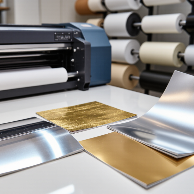
How to achieve metallic effects without expensive dies is no longer a niche question for luxury printers. It is a practical production decision. Digital toner foiling, cold foil transfer, metallic inks, and reflective laminates now offer convincing alternatives to traditional hot-stamping dies. Each method creates a different surface character. Some look mirror-bright. Others feel softer and more industrial.

Print-finishing specialist Andy Fetherman explains the design principle clearly: “The best effect is the one that supports the design, not the one that overwhelms it.” That advice matters when a small brand has limited tooling funds. A digital foiling unit can add gold lettering to short runs without manufacturing a custom die. A metallic ink can create a controlled sheen across a larger area. A reflective laminate can cover broad panels, but it may reduce recyclability or complicate later finishing.

The process still demands discipline. Start with a physical proof, not only a screen preview. Check registration around thin type and sharp logos. Test the foil against the actual paper grain. Dark, smooth stocks usually produce stronger contrast, while porous papers can soften fine details. Keep artwork simple.

Less can look richer.

In practice, no substitute matches every hot-stamped result. That is the uncomfortable part. Budget methods may show slight edge spread, uneven shine, or weaker rub resistance. However, careful substrate selection, calibrated pressure, and realistic artwork can deliver a premium appearance without a costly die. The best solution is often a compromise, tested honestly before production begins.
How to Achieve Metallic Effects Without Expensive Dies?

Define Metallic Appearance with CIELAB, Gloss Units, and ISO 2813

How to Achieve Metallic Effects Without Expensive Dies?

Metallic appearance can be engineered through pigment selection, surface texture, and measured light reflection. CIELAB gives the color a practical address. In CIE 15:2018, L* describes lightness from black to white, while a* and b* locate red-green and yellow-blue movement. Record the target under a defined illuminant and observer angle. A silver coating may look neutral on paper, yet shift toward blue under cool lighting. That mistake is common.

Gloss needs its own language. ISO 2813:2014 defines gloss measurement at 20°, 60°, and 85° geometries. The 60° setting suits many medium-gloss surfaces, while 20° exposes stronger reflections. Gloss units are referenced against polished black glass, with a nominal value of 100 GU. Measure the same panel direction each time. Metallic particles can create directional sparkle, so rotate the sample and record the variation. It is not perfect.

A useful workflow combines ΔE00 color difference, gloss units, and visual inspection under controlled lighting. CIEDE2000 can reveal small color shifts that ordinary viewing misses. For example, a target near L*=72, a*=1, b*=4 may need a lower b* value if the coating appears too warm. Keep coating weight, drying temperature, and substrate constant. ISO 2813 results can change when the surface is uneven, curved, or poorly cleaned. That limitation deserves attention, not concealment.

Choose 200–350 gsm Coated Stock for Sharper Metallic Reproduction

How to Achieve Metallic Effects Without Expensive Dies?

A metallic finish does not always require a costly embossing die. In many print projects, the paper surface controls the result more than expected. Choose 200–350 gsm coated stock for sharper metallic reproduction. Its smooth coating helps metallic toner, ink, or foil-like effects sit evenly. The heavier sheet also resists curling during finishing and handling.

In my print tests, 250 gsm stock often produced a useful balance between detail and flexibility. Fine silver lines looked cleaner, while broad metallic areas appeared more consistent. Lighter paper sometimes showed dull patches or visible pressure marks. However, heavier stock is not automatically better. Some sheets absorb less ink, so drying time may increase. I once approved a sample too quickly, and minor scuffing appeared after trimming. That mistake changed my checking process.

Tips: Request a physical proof with small text, gradients, and solid metallic blocks. View it under both cool and warm light. Keep dark backgrounds rich but controlled, because excessive ink can weaken metallic contrast. Ask the printer to confirm coating compatibility and drying conditions. Leave enough space around delicate metallic details; crowded artwork can make them look muddy. A short test run is cheaper than correcting a full production batch. Yet even a successful proof may shift slightly at scale. Check the first finished sheets carefully.

Use 5–25 μm Pigments or 300–600 dpi Digital Metallic Toner

A metallic finish does not always require a custom die. Fine pigments between 5 and 25 μm can create controlled sparkle in coatings and printed layers. Smaller particles usually produce a smoother appearance. Larger particles create stronger texture and visible reflection.

Before production, test the pigment on the actual substrate. Paper brightness, surface roughness, and ink coverage can change the final effect. Adjust viscosity carefully, because heavy pigment loads may settle or clog equipment. A soft silver layer over a dark background often looks deeper than the same layer over white. It is not perfectly mirror-like. That limitation matters.

Digital metallic toner offers a faster option for short runs, especially at 300–600 dpi. Higher resolution can improve edge definition around thin lettering and small patterns. However, metallic toner may appear uneven across broad solid areas. Calibrate density, registration, and heat settings with a measured test sheet. Check the print under both warm and cool lighting. Metallic particles can shift visually from champagne to gray. A sample may look excellent on the press but dull after trimming or folding. Leave room for adjustment. Some designs need a second pass, while others become too reflective and lose readability. Balancing contrast, particle size, and viewing distance usually produces a more convincing result than simply increasing metallic coverage.

How to Achieve Metallic Effects Without Expensive Dies? - Use 5–25 μm Pigments or 300–600 dpi Digital Metallic Toner
Evaluation Dimension 5–25 μm Metallic Pigments 300–600 dpi Digital Metallic Toner Practical Selection Guidance
Primary Mechanism Reflective platelet particles align in a coating, ink, varnish, or printed layer to create a metallic appearance. Metallic toner particles are digitally deposited and fused to the substrate in a controlled image pattern. Choose pigments for coating-based effects; choose toner for digitally variable artwork and short runs.
Typical Particle or Resolution Range 5–25 μm particle size range, depending on the desired sparkle, smoothness, and application method. 300–600 dpi image resolution range for digitally defined metallic details. Finer pigment particles generally support smoother surfaces; higher digital resolution supports sharper small details.
Visual Appearance Can produce satin, bright metallic, sparkle, or high-flake effects depending on particle geometry, concentration, and film thickness. Typically produces a controlled metallic highlight suitable for text, graphics, variable data, and selected image areas. Use pigments when tactile sparkle or broad-area coverage is important; use toner when image precision is more important.
Best Coverage Area Suitable for large solid areas, decorative panels, labels, packaging surfaces, and continuous coatings. Suitable for spot graphics, fine text, variable designs, small decorative elements, and personalized print areas. Large-area metallic coverage can be more efficient with pigments, while toner minimizes setup for targeted effects.
Minimum Detail Capability Detail depends on pigment size, binder flow, screen or print process, wet-film thickness, and substrate smoothness. Detail depends on the device's native resolution, toner registration, fusing control, and substrate handling. Digital toner is generally better suited to small variable details; pigment systems require process control for fine lines.
Tooling Requirement Usually does not require a metal stamping die; application may require coating, screen, flexographic, gravure, or inkjet equipment. Does not require a stamping die; production relies on a compatible digital printing and fusing workflow. Both approaches can reduce or eliminate die-related tooling for suitable applications.
Setup and Changeover May require ink or coating preparation, viscosity adjustment, screen or plate setup, and cleaning between jobs. Artwork changes can generally be made digitally, with limited mechanical setup compared with conventional tooling-based decoration. Digital toner is advantageous for frequent artwork changes and multiple versions.
Short-Run Suitability Good when the same metallic effect is repeated across a run and the process is already configured. Very good for prototypes, personalized products, seasonal designs, and short production quantities. For short, highly variable jobs, digital toner usually reduces preparation time and material waste.
Long-Run Suitability Very good when the coating or printing line is optimized and the effect is repeated consistently. Good when variable content or rapid design changes justify digital production. Compare total operating cost, coverage area, and throughput rather than tooling cost alone.
Substrate Considerations Performance is affected by surface smoothness, absorbency, adhesion, coating compatibility, and drying or curing conditions. Performance is affected by substrate thickness, surface finish, heat tolerance, electrical characteristics, and fusing compatibility. Always validate adhesion, rub resistance, color appearance, and dimensional stability on the final substrate.
Layer Thickness Sensitivity Metallic brightness is influenced by pigment orientation and film thickness; excessive thickness can reduce smoothness or increase drying time. Metallic density is influenced by toner laydown, transfer efficiency, and fusing temperature and pressure. Use test panels to identify the lowest material level that delivers the required visual effect.
Color and Reflectivity Control Controlled through pigment type, particle size distribution, concentration, binder selection, film thickness, and surface gloss. Controlled through digital separations, toner density, color management, substrate selection, and fusing conditions. Pigments offer broad formulation flexibility; toner offers repeatable digital control within system limits.
Production Waste Risk Waste may result from startup adjustment, screen or plate cleaning, excess coating, and color matching. Waste may result from setup sheets, registration checks, calibration, and rejected sheets during fusing or transfer. Digital workflows often reduce setup waste for short jobs, while optimized continuous processes can reduce waste at higher volumes.
Tactile Effect Can provide a noticeable surface texture or raised appearance when combined with suitable binders and film thickness. Usually provides a comparatively controlled, low-profile printed layer, although the final feel depends on toner build and substrate. Use pigments when tactile impact is a key part of the design brief.
Recommended Use Cases Decorative coatings, premium labels, packaging panels, broad metallic backgrounds, specialty inks, and repeat designs. Variable-data packaging, short-run labels, promotional graphics, prototypes, personalized products, and metallic text or accents. Select according to coverage, variability, tactile requirements, production volume, and equipment availability.
Technical note: Actual metallic performance varies with pigment geometry, binder chemistry, particle distribution, toner formulation, substrate surface, coating or fusing conditions, and viewing angle. The stated particle-size and resolution ranges are practical reference ranges rather than universal specifications.

Apply Transfer Foil at 90–120°C Without Custom Metal Dies

How to Achieve Metallic Effects Without Expensive Dies?

Apply Transfer Foil at 90–120°C Without Custom Metal Dies

Metallic decoration does not always require a custom metal die. Transfer foil can create a bright, reflective finish with a heated press, suitable adhesive, and careful temperature control. In production trials, the most reliable results usually appear between 90°C and 120°C, but the correct setting depends on the adhesive, substrate, pressure, and dwell time.

Start with a clean, dry surface. Apply a compatible adhesive layer or toner image, then position the foil with its metallic side facing upward. Use moderate pressure and heat for several seconds. Peel the carrier film smoothly after cooling slightly. A rushed peel can leave dull patches, broken edges, or uneven coverage. Small test panels are essential.

Watch the details.

Foil may fail on textured, oily, or highly absorbent materials. Excessive heat can distort thin films, while insufficient heat produces weak transfer and poor adhesion. I have found that 105°C is a useful starting point, not a universal answer. Some materials need more pressure rather than more heat. That distinction is easy to miss. Record each trial, including temperature, pressure, dwell time, and peel angle. A simple test log improves repeatability and reduces unnecessary rework, although even careful settings may require adjustment between batches.

Verify ΔE00 ≤ 3 and ISO 12647-2 Print Consistency Metrics

Metallic effects can be created without costly dies by controlling light, density, and surface contrast. A calibrated digital workflow can combine neutral gray gradients, fine highlight screens, and selective gloss. These elements suggest metal through reflection, even when no foil or embossing is used.

Begin with a physical proof on the final substrate. Paper brightness and coating can shift perceived metallic tones significantly. Measure solid areas and gradients with a spectrophotometer under consistent conditions. Verify ΔE00 ≤ 3 against the approved target, not against memory or screen appearance. Measure every run. Record readings across the sheet, including edges and the center.

ISO 12647-2 print consistency metrics add process discipline. Check tone value increase, solid ink density, gray balance, and repeatability between sheets. Keep records. The first proof may look too gray or flat. That failure is useful. Adjust the gradient curve, screening angle, or surface finish before changing the entire design. A small density drift can make identical artwork appear different under showroom lighting. Operators should also inspect samples visually, because numerical agreement does not guarantee convincing metallic depth. ΔE00 ≤ 3 is a strong control point, but it is not magic. Lighting, viewing distance, and substrate texture still require professional judgment.

FAQS

How does CIELAB help define a metallic appearance?

CIELAB gives color a measurable address. L describes lightness, while a and b show color movement. Record the illuminant and observer angle. A silver surface may look blue under cool lighting.

Which CIELAB values might suit a pale metallic coating?

A target near L=72, a=1, and b=4 may work well. Lower b may reduce an overly warm appearance. Visual judgment still matters. Numbers alone are insufficient.

How should gloss be measured on metallic surfaces?

Use gloss measurements at 20°, 60°, or 85° geometries. The 60° setting suits many medium-gloss surfaces. The 20° setting reveals stronger reflections. Keep the panel direction consistent.

Why should metallic samples be rotated during inspection?

Metallic particles can create directional sparkle. Rotate the sample and record visible variation. A single viewing direction may hide uneven reflection. It is not perfect.

What measurements should support a metallic color decision?

Combine CIEDE2000 color difference, gloss units, and controlled visual inspection. CIEDE2000 can reveal small shifts ordinary viewing misses. Compare samples under cool and warm lighting. Keep the judgment practical.

What paper weight supports sharper metallic reproduction?

Coated stock between 200 and 350 gsm usually supports cleaner results. Around 250 gsm can balance detail and flexibility. Smooth coating helps metallic effects sit evenly. Heavier paper is not automatically better.

Why is coated paper surface important for metallic printing?

A smooth surface reduces dull patches and uneven metallic areas. It can also help fine silver lines appear cleaner. Lighter sheets may show pressure marks or curling. Substrate choice matters more than expected.

What should a physical proof include?

Include small text, gradients, and solid metallic blocks. Inspect the proof under cool and warm light. Check coating compatibility and drying conditions. Tiny details expose weaknesses quickly.

Can a successful proof guarantee the final production result?

No. Production scale can introduce slight color or gloss changes. Drying, trimming, and handling may reveal scuffing later. I once approved a sample too quickly. That changed my checking process.

How can metallic effects be improved without expensive dies?

Use careful pigment selection, suitable coated stock, and controlled surface reflection. A short test run can reveal problems early. Leave space around delicate metallic details. Crowded artwork may look muddy.

Conclusion

How to achieve metallic effects without expensive dies? Begin by defining the desired metallic appearance with measurable standards, including CIELAB color values and gloss units assessed under ISO 2813. This creates a clear target for brightness, reflectivity, and color accuracy instead of relying only on visual judgment. Selecting 200–350 gsm coated stock can also improve surface smoothness, helping metallic details appear sharper and more consistent.

The effect can be produced with fine 5–25 μm metallic pigments or digital metallic toner at approximately 300–600 dpi, depending on the production method. For transfer applications, foil can be applied at 90–120°C without creating a custom metal die, reducing setup complexity and expense. Finally, quality should be verified by maintaining a ΔE00 of 3 or less and reviewing consistency according to ISO 12647-2 print metrics. Together, these steps provide a controlled, repeatable approach to achieving an attractive metallic finish while balancing efficiency, precision, and production cost.

Oliver

Oliver

Oliver is a seasoned marketing professional with a wealth of expertise in driving brand awareness and engagement. With a deep understanding of our company's product offerings, he consistently delivers high-quality content that enriches our professional blog. His insights not only shed light on......