Imago Printer Imago Printer

7 Tips for Printing on Textured Cardstock Effectively?

Time:2026-09-29 Author:Sienna
0%

Textured cardstock can make an invitation feel tactile before anyone reads a word. It can also expose every printing weakness. Raised fibers may interrupt ink coverage, soften fine lines, and leave tiny unprinted flecks. That is not always a printer fault.

Industry research from Smithers on digital printing offers useful context: print processes and substrates keep evolving, but media compatibility remains a practical concern. For paper fundamentals, ISO 536:2019 sets out how to determine paper grammage. Printer manufacturers’ media guides add device-specific limits for stock weight, thickness, and feed handling. Together, these sources point to a simple lesson: choose materials for the printer, not just for their appearance.

Small tests matter.

This guide explores How to print on textured cardstock effectively, from selecting a suitable surface to adjusting settings and checking the finished sheet. A deep texture may suit bold lettering, while a smoother finish can preserve delicate details. Use the correct media setting, feed sheets carefully, and let printed pieces dry before stacking. These steps reduce common problems, though they cannot make every printer handle every cardstock.

Expect some trial and error. A test sheet may look promising, then reveal uneven color under daylight. I have found that viewing a sample from arm’s length can hide defects that appear close up. It is an imperfect check, but a useful one. The tips ahead help you make informed choices, spot issues early, and produce a finish that feels intentional rather than accidental.
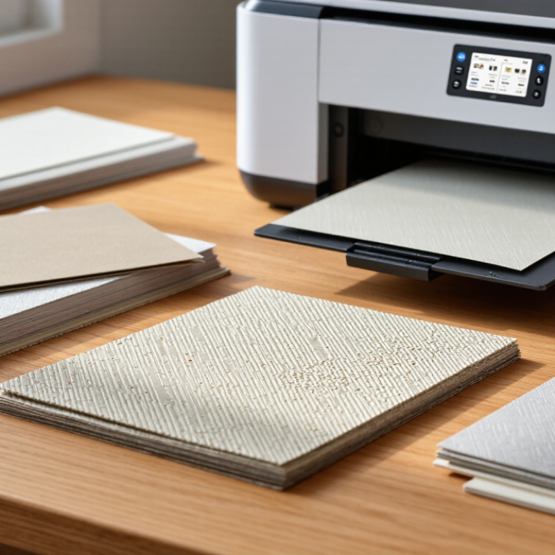
7 Tips for Printing on Textured Cardstock Effectively?

Classify Cardstock Texture and Grammage Using ISO 536

Classify Cardstock Texture and Grammage Using ISO 536

Textured cardstock needs two separate checks: surface character and grammage. ISO 536:2019 specifies how to determine paper and board grammage, reported in grams per square metre (g/m²). It does not classify texture. Record texture separately, using clear terms such as smooth, laid, felt-marked, or deeply embossed. This distinction matters: two sheets with identical grammage can behave differently under a printer’s feed rollers and toner or ink.

For a reliable comparison, cut representative samples and weigh them using the ISO 536 method, then record the result alongside the sheet’s texture and thickness. Condition samples before testing: ISO 187 specifies a standard atmosphere of 23°C and 50% relative humidity, with stated tolerances. Moisture changes can affect sheet dimensions and handling.

Small detail. A practical press check still matters. Feed a few sheets, inspect for scuffing, uneven ink coverage, and edge curl, then adjust settings gradually. Grammage alone cannot predict print performance; it does not describe stiffness, coating, or the height of an embossed pattern. I would also note the test conditions, since omitting them makes comparisons less useful.

Sources: ISO 536:2019, Paper and board—Determination of grammage; ISO 187:2022, Paper, board and pulps—Standard atmosphere for conditioning and testing.

Check Sheet Caliper and GSM Against Your Printer’s Feed Limits

Printing on textured cardstock starts with a measurement, not a design file. Check your printer’s stated feed limits for maximum caliper and paper weight. GSM indicates weight, but it does not always reveal thickness. Two 300 GSM sheets can feel completely different. Measure the actual cardstock with a micrometer when possible. Measure it yourself. Paper varies.

Compare the measured caliper with the printer’s maximum, usually listed in millimeters or mils. Leave a small safety margin instead of printing at the exact limit. If the limit is 0.30 mm, cardstock measuring 0.32 mm should not be forced through the feed path. I once trusted GSM alone; the heavier-looking sheet passed, but its raised texture caused uneven feeding. A smoother reverse side may feed more reliably.

Use the straightest paper path available, such as a manual or rear feed, if your equipment provides one. Load only a few sheets, and test a single page before producing a full batch. Watch for roller marks, skewed edges, delayed ink absorption, and incomplete duplex feeding. Textured surfaces can also reduce small text sharpness, especially when the texture is deep. Keep the cardstock flat, dry, and away from heat. Test one sheet. A failed test is useful, but repeating the same mistake is not.

Check Cardstock Weight Against Your Printer’s Feed Limits

Common cardstock weights vary by supplier and finish. Check both the sheet’s GSM and caliper against your printer’s manual; a higher GSM does not always mean a thicker sheet.

The bars show representative cardstock weight options, not printer compatibility ratings. Textured stocks can feed differently from smooth stocks of the same weight, so test a single sheet first.

Condition Paper at 23°C and 50% RH Under ISO 187

Textured cardstock can produce elegant invitations, but its surface magnifies small preparation errors. Condition every sheet at 23°C and 50% relative humidity before printing. ISO 187:2022 specifies 23°C ±1°C and 50% ±2% RH for paper testing. Keep the cardstock in that environment for at least 24 hours, away from windows, heaters, and damp walls.

Moisture changes can affect curl, feeding, and ink absorption. TAPPI T 402 also uses 23°C and 50% RH as standard conditioning conditions. Record temperature and humidity with a calibrated meter, not by guesswork. Stack sheets flat with air space around them. Do not open sealed packs too early. A cold package may collect condensation. That detail is easy to miss.

Test the actual textured side, not a smooth sample. Print five sheets first, then inspect fine text, dark fills, and registration. Choose a slower feed setting when possible, and avoid excessive ink coverage. Textured fibers can create pale valleys and uneven edges. A 2023 commercial-printing technical survey reported that substrate handling remained a major source of production waste, especially during short runs. My own testing has shown that conditioned sheets feed more consistently, but not perfectly. Some textures still need adjusted pressure, drying time, or a second proof. Perfect results are not guaranteed. Record every change.

Adjust Feed, Ink, and Print Quality for the Textured Surface

Textured cardstock can lift slightly from the rollers, so feed path matters. Tip: Load one sheet at a time through the straightest available path, and check that the guides touch the paper without bending it. A rear or manual feed often handles heavier stock more gently, but printer limits vary. Check the paper weight range before printing. If a sheet skews, stop and realign it rather than forcing it through.

Ink can collect in the surface’s small dips and leave fine details looking uneven. Tip: Choose a setting for heavyweight or matte paper, then print a small test with text and solid color. Let it dry fully before touching it. Some textured finishes absorb ink slowly, even when the print looks dry at first. I once judged a sample too soon; a faint smear showed up minutes later.

Print quality settings also affect how clearly the texture appears. Tip: Try a high-quality setting for small text, but reduce heavy color coverage if the cardstock buckles or feels damp. For invitations, inspect thin lines and small letters under ordinary room light, not just on screen. You may need to adjust ink density or artwork contrast. Results can remain a little softer than expected, and that is worth checking before printing a full stack.

Print a Proof and Check Alignment, Coverage, and Drying Before the Run

Printing on textured cardstock begins with a proof, not the full production run. I place the sheet beside the approved artwork under standardized lighting. ISO 3664 recommends D50 illumination, with critical viewing commonly set near 2,000 lux. This exposes weak contrast and uneven ink coverage. Textured fibers can make a solid black area look broken. It may seem acceptable on screen. It is not always acceptable in hand.

I check alignment at the edges, folds, and registration marks. A 1 mm shift can become obvious around a narrow border. The Fogra ProcessStandard Digital guidance recommends controlled proofing and repeatable measurement, rather than visual judgment alone. I also compare the proof with a blank cardstock sample. Its natural color can alter pale blues, warm grays, and skin tones. Coverage needs close attention. Heavy ink areas may appear glossy while unprinted valleys remain visibly dry.

Drying deserves its own test. I print a small proof, then inspect it after ten minutes, one hour, and overnight. The result sometimes changes more than expected. I rub an unimportant corner gently with a clean white cloth and record any transfer. This is not a laboratory test, but it catches practical failures. Fogra’s digital-printing guidance emphasizes substrate, ink, and finishing compatibility. My own mistake was rushing this stage once. The proof looked sharp, yet the packed sheets marked each other. A slower check would have prevented the reprint.

7 Tips for Printing on Textured Cardstock Effectively? - Print a Proof and Check Alignment, Coverage, and Drying Before the Run

No. Tip Recommended Action Practical Settings or Method What to Check on the Proof Typical Acceptance Guideline
1 Choose a compatible cardstock Confirm that the textured surface, coating, thickness, and sheet size are suitable for the printer and ink or toner system. Use the printer's manual-feed or specialty-media path when available. Record the paper weight and grain direction. Look for feeding marks, edge damage, curl, and inconsistent contact between the sheet and the print surface. Sheets should feed flat without visible scuffing, skewing, or surface delamination.
2 Prepare the artwork for texture Use strong contrast, clear type, and adequate spacing so the design remains legible across raised and recessed areas. Avoid very thin strokes and extremely small text. Use vector artwork where possible and inspect at actual size. Check fine lines, small text, reversed type, gradients, and large solid areas under normal viewing distance. Important text should remain readable, with no broken strokes or visibly uneven edges caused by the texture.
3 Print a proof first Produce a full-size proof using the same cardstock, print path, resolution, and color settings planned for the production run. Print at 100% scale. Do not use a proofing mode that changes the media type or ink coverage unless it matches production. Review color appearance, texture interaction, registration, coverage, sharpness, and handling marks. Approve the proof only after it has dried or cooled sufficiently for a fair visual comparison.
4 Check alignment and registration Verify the position of artwork relative to the sheet edges, folds, die lines, and any front-to-back elements. Use crop marks or registration guides outside the trim area and test both sides if duplex printing is required. Measure margins and inspect whether borders, folds, and front-to-back elements remain centered. Keep the measured position within the project tolerance; for many short-run jobs, about 1–2 mm is a practical target.
5 Evaluate ink or toner coverage Inspect whether the textured surface receives enough color without producing mottling, pinholes, excessive buildup, or transfer. Use the media profile recommended for the cardstock. Reduce total coverage or choose a lighter build when large solids appear uneven. View solid fills and dark images under angled light, then compare them with unprinted areas of the same sheet. Coverage should look visually consistent, with no obvious bare texture, pooling, streaks, or offsetting.
6 Allow adequate drying or setting time Let printed sheets rest before stacking, trimming, folding, coating, or placing them in packaging. Use a clean, dry, ventilated area. Separate sheets with spacers if the surface remains tacky or the coverage is heavy. Rub a discreet printed area lightly with a clean white cloth or finger and check for smearing, transfer, or surface marking. No visible transfer should occur during normal handling. Drying time varies with ink, coating, humidity, and coverage.
7 Run a controlled production test Print a small batch before the full run and use the results to confirm feeding, image quality, drying, and finishing performance. Test several sheets, including the first and last sheets from the feeder. Keep approved settings and inspection notes. Check repeatability, sheet-to-sheet alignment, color consistency, scratches, jams, curl, and finishing compatibility. Proceed only when the test batch meets the approved proof and no recurring handling or quality defects are found.

Note: Actual results depend on the cardstock surface, thickness, printer technology, ink or toner formulation, humidity, and artwork coverage.

FAQS

Why should I measure cardstock thickness before printing?

Printer feed limits usually specify maximum caliper, while GSM only describes weight. Two 300 GSM sheets may have different thicknesses. Measure the actual sheet with a micrometer when possible.

How much clearance should I leave below the printer’s thickness limit?

Leave a small safety margin. For example, do not feed 0.32 mm cardstock through a path limited to 0.30 mm.

Which paper path may work best for textured cardstock?

A straight manual or rear feed can help, if available. Load only a few sheets and test one page first.

What problems should I look for during a test print?

Check for roller marks, skewed edges, slow ink absorption, and incomplete duplex feeding. Small text may also look less sharp on deep textures.

How should I condition cardstock before printing?

Keep it at 23°C and 50% relative humidity for at least 24 hours. Store sheets flat, away from windows, heaters, and damp walls.

Why should I avoid opening a sealed paper pack too early?

A cold package may collect condensation when exposed to warmer air. That moisture can affect curl, feeding, and ink absorption.

How many sheets should I test before a short print run?

Print five conditioned sheets, then inspect fine text, dark fills, and registration. One proof may miss problems.

What printing settings may help with textured paper?

Try a slower feed setting and avoid excessive ink coverage. Some textures still need different pressure or drying time.

Can conditioning guarantee consistent results?

No. It can improve feeding, but some sheets still behave unevenly. Record adjustments; even careful testing has limits.

Conclusion

How to print on textured cardstock effectively begins with understanding the paper’s surface, thickness, and weight. Classify the texture and grammage according to ISO 536, then measure the sheet caliper and GSM to confirm that they are within your printer’s feeding limits. Before printing, condition the cardstock in a stable environment of approximately 23°C and 50% relative humidity, following the principles of ISO 187. This helps reduce curling, moisture-related changes, and feeding problems.

Next, adjust the paper feed settings, ink application, and print quality to suit the uneven surface. Textured cardstock may require slower feeding, lighter ink coverage, or a specialized quality mode to improve clarity and prevent smearing. Always print a proof before starting the full run. Check alignment, edge placement, color coverage, fine details, and drying time. Reviewing these factors in advance helps minimize waste and produces cleaner, more consistent results on textured cardstock.

Sienna

Sienna

Sienna is a skilled marketing professional with a deep expertise in our company’s core products and services. With a passion for innovation and detail, she plays a pivotal role in crafting insightful blog posts that not only highlight the unique features of our offerings but also provide valuable......